

 Platform Overview

 Integration Hub

 Agent One™

 Agent One™ Teams

 Customer Data Management

 Personalization

 Journey Orchestration

 Reporting & Data

 Behavioral Analytics

 Web
Web

 Email
Email

 Site Search

 Conversational CX

 WhatsApp

 Web Push

 InStory

 App
App

 SMS & RCS

 Join the $0 Migration Movement™

 The Insider One Difference

 Compare Vendors

 Switch to Insider One

 Success Story

 Retail & Ecommerce

 Financial Services

 Travel & Hospitality

 Beauty & Cosmetics

 Automotive

 Telecommunications

 Total Economic Impact™ Study

 Blog
Blog

 E-Books & Guides

 Events

 Glossary
Email Design Best Practices That Actually Move Clicks and Conversions

Updated on 8 Oct 2026
8 mins.
Table of Contents
- Summary
- Why open rates stopped being the right design metric
- Designing for three different dark modes, not one
- Mobile-first layouts that hold up across every inbox
- Accessibility choices that double as conversion levers
- Turning design tweaks into measurable revenue lift
- Conclusion
- Frequently Asked Questions
Most Popular
Summary
- Apple Mail Privacy Protection inflates opens, so design quality assurance needs to run on click-through and conversion data instead
- Dark mode renders differently in Apple Mail, Outlook, and Gmail, so one CSS fix will not cover all three inboxes
- A 600px fluid-hybrid single-column layout holds up across phones and legacy Outlook without relying on media queries
- Contrast, live text, and alt text are not just accessibility checkboxes, they reduce spam-folder risk and improve readability
- Isolating one design variable per send is how small tweaks turn into measurable revenue lift over time
Email design best practices in 2026 start with a hard truth: the open rate a team used to judge a redesign against stopped being reliable once Apple Mail Privacy Protection (MPP) began pre-fetching images at scale.
That shift changed what “good design” means for lifecycle and customer relationship management (CRM) marketers who own template performance and have to explain it to leadership.
This article is for the lifecycle and CRM marketers at mid-market to enterprise brands who own email template design and reporting, not the ones running a single monthly newsletter.
You will get concrete fixes for the three-way dark mode split across Apple Mail, Outlook, and Gmail, a mobile-first layout built to survive inconsistent rendering, and a way to treat accessibility choices as conversion levers instead of compliance line items.
By the end, you will have a framework for testing design changes against click and conversion data rather than a metric that stopped meaning much the day Apple changed it.
Why open rates stopped being the right design metric
Open rate is no longer a trustworthy signal for judging an email design change. Apple Mail Privacy Protection pre-fetches every image in a message the moment it lands in an inbox it protects, whether or not the subscriber ever looks at it, and that counts as an open regardless of real engagement.
For any brand with a meaningful share of Apple Mail subscribers, that inflation is enough to mask the actual effect of a layout, color, or hierarchy change.
Rebuilding design quality assurance means shifting the primary scorecard from opens to click-through rate, reply rate, and post-click conversion. A layout redesign that does not move clicks or revenue did not work, no matter what the open rate implies.
Teams that still lead with open rate risk shipping designs that look successful on a dashboard but do nothing for the pipeline.
- Click-through rate by template variant, not just by campaign
- Conversion rate on the landing page tied to that specific send
- Reply rate for lifecycle sequences, where a reply signals real engagement
- Revenue per recipient, segmented by device and email client
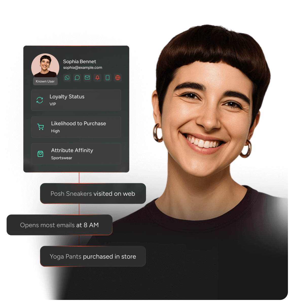
None of this works if click and conversion data live in a different system than the email platform. Marketers who unify sends with order and behavioral data through a Customer Data Management layer can trace a template change straight through to revenue per recipient, instead of relying on a proxy metric that Apple’s MPP has already compromised.
Designing for three different dark modes, not one
Apple Mail, Outlook, and Gmail each handle dark mode differently, and a single CSS fix will not cover all three. Apple Mail generally respects the preferred-color-scheme media query and lets senders define exact colors for dark mode.
Outlook desktop applies its own inversion algorithm regardless of what CSS specifies, often swapping backgrounds and text in ways a sender never intended. Gmail’s behavior varies by app version and sometimes applies partial inversion even when a query is present.
Concrete fixes that survive all three
Building for one client and hoping the others behave the same is how logos disappear and CTA buttons go invisible. A few structural choices reduce that risk across the board:
- Define explicit background and text colors with prefers-color-scheme rather than relying on automatic inversion to guess correctly
- Build logos and key images with transparent backgrounds and a subtle outline or padding, so an inverted background does not swallow the mark
- Avoid pairing pure white backgrounds with pure black text as the only color combination, since off-white and dark gray hold up better under forced inversion
- Test every template in Apple Mail, Outlook desktop, and the Gmail app before it ships, not just the client your team defaults to
Skip this step and a CTA can render unreadable in whichever client applies the most aggressive inversion, exactly the kind of rendering failure that MPP-inflated open rates will hide from a performance dashboard until conversion data exposes it.
Mobile-first layouts that hold up across every inbox
A 600px fluid-hybrid single-column layout is the most reliable structure across screen sizes, including legacy Outlook versions that ignore media queries entirely.
The approach sets a max-width table around 600px with percentage-based inner elements, so the layout scales down naturally on a 320px phone screen while still holding a usable fixed width in older desktop clients that render without responsive support.
Font sizing, tap targets, and CTA placement matter as much as the underlying grid, especially since most lifecycle sends are read on a phone in under ten seconds.
- Set body text no smaller than 14 pixels, with 16 as a safer default, so subscribers are not pinching to zoom
- Size CTA buttons at least 44 by 44 pixels with generous padding, positioned within easy thumb reach
- Keep the value proposition and CTA above the fold in a single stacking order rather than spreading them across a multi-column layout that collapses awkwardly
- Use a line height of at least 1.4 to keep dense paragraphs readable at small sizes
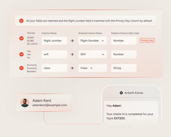
A modular build process makes this easier to maintain across dozens of templates than hand-coding one-off layouts every time a campaign ships. Philips increased average order value by 35% by pairing consistent, personalized layouts with relevant product recommendations, a reminder that layout discipline and personalization work together rather than competing for space. Insider One’s modular email editor is built around this same reusable-block logic.
Accessibility choices that double as conversion levers
Contrast ratio, live text, and alt text are not compliance checkboxes, they directly change how many people can read, act on, and even receive an email at all. Insufficient contrast makes CTA buttons and body copy hard to read for a meaningful share of subscribers, and inbox providers increasingly weigh image-heavy, text-light sends as lower quality, which puts image-only promotions at greater deliverability risk than sends built with a mix of live text and images.
- Maintain a contrast ratio of at least 4.5 to 1 for body text and 3 to 1 for large text and buttons, in line with WCAG guidance
- Replace image-only promotional sends with live HTML text for headlines and CTAs, so screen readers and spam filters can parse the message
- Write descriptive alt text for every product image rather than a placeholder, so the email still communicates when images are blocked by default
- Avoid conveying information through color alone, pairing a sale badge or urgency cue with text instead of relying on a red background
These choices also reduce legal exposure tied to inaccessible digital communications, but the more immediate return is engagement. Legible sends get read past the first line, and CTAs built as live text still get clicked when images fail to load or a subscriber runs an image-blocking client.
Turning design tweaks into measurable revenue lift
Isolating one design variable per send and testing it against click and conversion data is how design tweaks compound into measurable revenue lift, rather than a periodic full redesign that resets the learning curve. Hold everything else constant, run the test across a meaningful sample split by segment and device, and measure clicks and conversions instead of opens.
- CTA button color and copy tested against a control across at least two send cycles
- Content hierarchy order, value proposition then proof then CTA, tested against CTA-first layouts
- Image-to-text ratio, to see how a live-text-forward send compares against a heavier visual layout
- Segment-level rendering data split by Apple Mail, Gmail, and Outlook, to catch client-specific breakage before it costs conversions
ECCO achieved a 7.4x return on investment and a 95% conversion rate uplift by pairing structured testing with ongoing template refinement, evidence that incremental, measured iteration compounds faster than infrequent full redesigns.
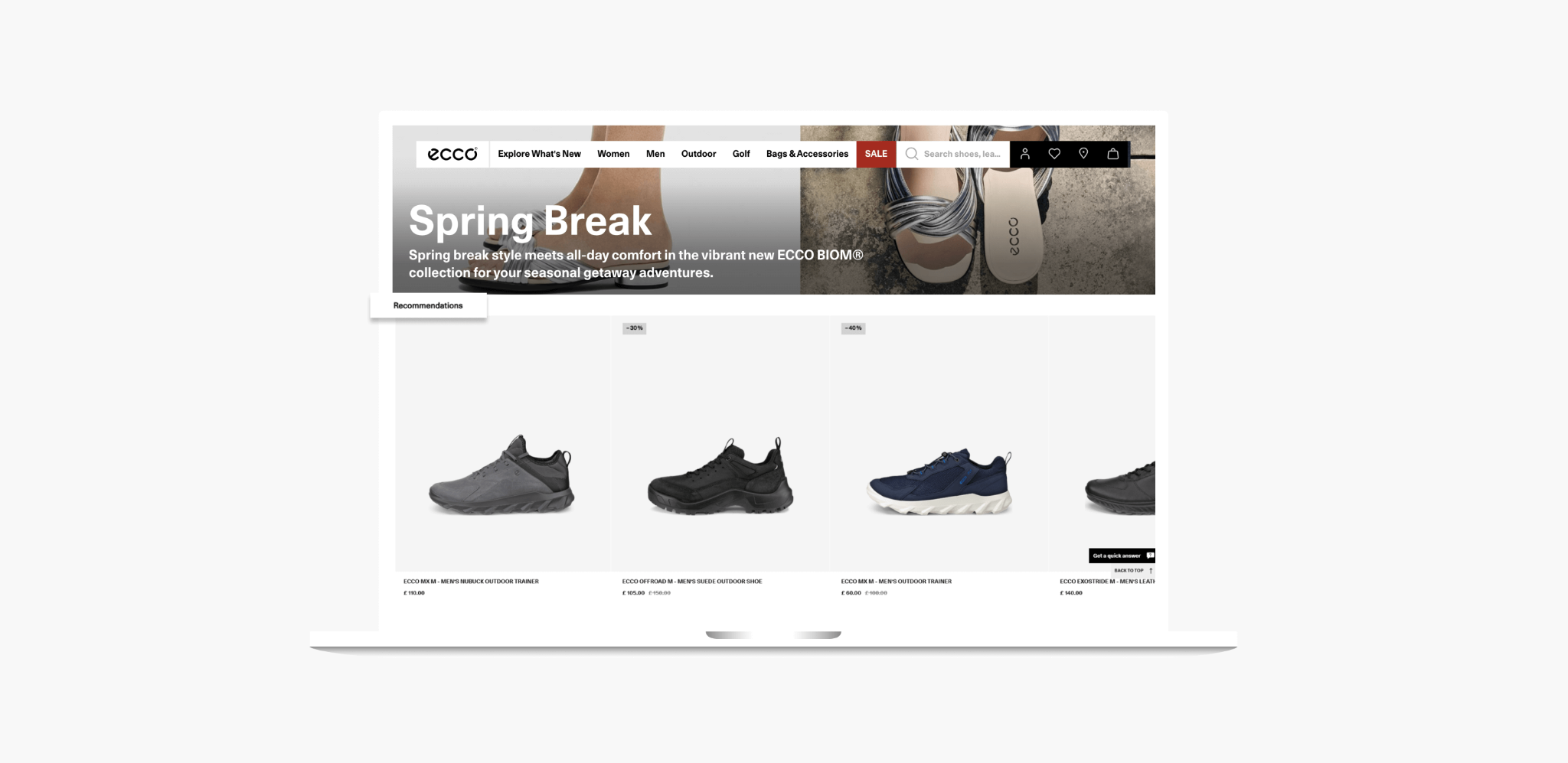

Layering in advanced segmentation sharpens this further, since a CTA color that wins for one lifecycle stage may lose for another. Running these tests inside a single platform that connects design, send, and revenue data removes the manual stitching that usually slows this kind of program down.
Conclusion
Email design best practices in 2026 are not about aesthetics, they are about proving a layout, color, or hierarchy choice actually moved a click or a conversion. Open rate cannot carry that proof anymore.
Teams that rebuild their design quality assurance around dark mode rendering, mobile-first structure, accessibility, and disciplined testing will keep finding lift long after a one-time redesign stops paying off.
Ready to see how a unified platform ties email design changes directly to revenue? Explore Insider One’s platform to see how connected Customer Data Management and segment-level rendering data help CRM teams test one design variable at a time and prove its impact on clicks and conversions, not just opens.
Frequently Asked Questions
Rebuild design quality assurance around click-through, reply, and conversion data instead of open rate, since Apple Mail Privacy Protection inflates. Then prioritize dark mode fixes for Apple Mail, Outlook, and Gmail separately, a fluid-hybrid mobile-first layout, and accessibility choices like contrast and live text.
Responsive design relies on media queries that adjust layout at set breakpoints, but legacy Outlook versions ignore them. Mobile-first, fluid-hybrid design uses a 600px table with percentage-based inner elements, so it scales naturally on small screens and still holds up in clients without media-query support.
Apple Mail generally respects prefers-color-scheme and lets senders set exact colors, while Outlook desktop applies its own automatic inversion regardless of CSS. Gmail’s handling varies by app version. Testing each client separately, rather than assuming one fix works everywhere, prevents invisible CTAs and unreadable text.
Contrast ratio, live text, and descriptive alt text improve readability and reduce the deliverability risk tied to image-heavy, text-light sends. These same choices also reduce legal exposure tied to inaccessible communications, making accessibility a design lever with both engagement and risk benefits.
Isolate one variable per test, such as CTA color, content hierarchy, or image-to-text ratio, and hold everything else constant. Measure results against click-through rate and conversion, split by segment and device, so wins compound over successive sends instead of resetting with each redesign. can we have a more Philipps related or modular email editor related image to replace this visual? It looks out of context to reader. Wdyt? @[email protected] _Assigned to [email protected]_

Keep Reading
4 min.

Chris Baldwin
3 Feb 2026
8 mins.
Chris Baldwin
8 Oct 2026
8 mins.
Chris Baldwin
8 Oct 2026